To see my stamping on muslin card for Paper Smooches Sparks, click HERE
To see my wedding card for Kate, click HERE
Runway Inspired Challenge...SAGA
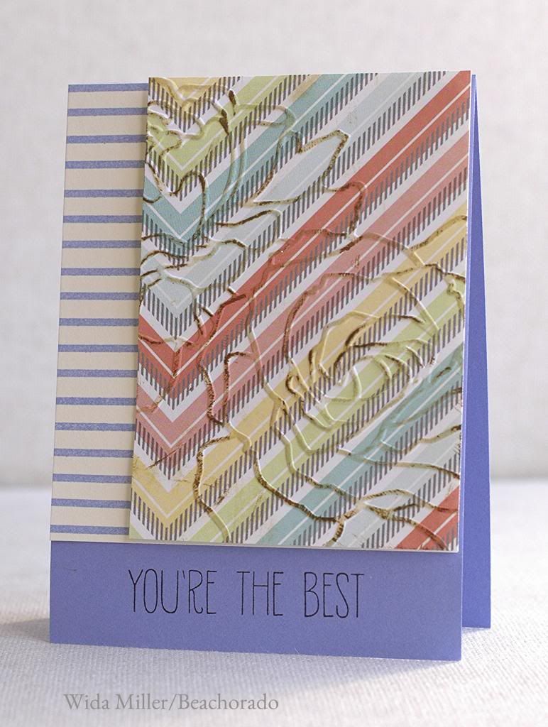
She didn't like it. It was the blue? the inked embossing? she suggested I sand down the flower so the white shows through instead of the ink. I gave it a go.
um, no.
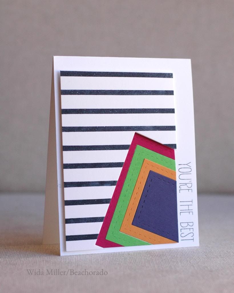
So I went back to work and created this. But it didn't look like ME.
I showed it to Elena Roussakis who still didn't like it. The stitching was throwing her off.
And then Nina Yang looked at it and thought the colors on the square were wrong. It didn't look like me she said. I wanted to hug her because that is what I felt too!
Pamela Ho said the stripes were too wide
Laura Bassen said it needed a softer color palate.
The point was...it still wasn't right. So I went back again.
It was almost midnight, I snapped a photo and sent it to Elena thinking FOR SURE she would approve. I woke up the next morning to see this email reply:
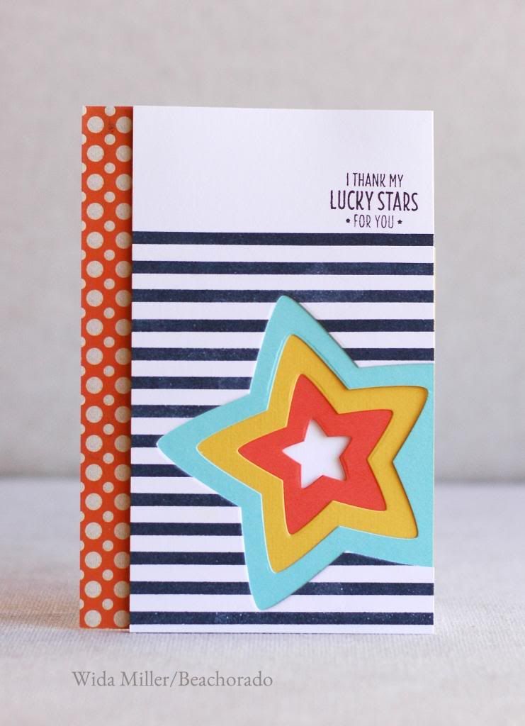
My heart sank, but then I got a determination to make her love it! I replied, what paper would make this card shine? and she replied with certainty: POLKA DOTS!
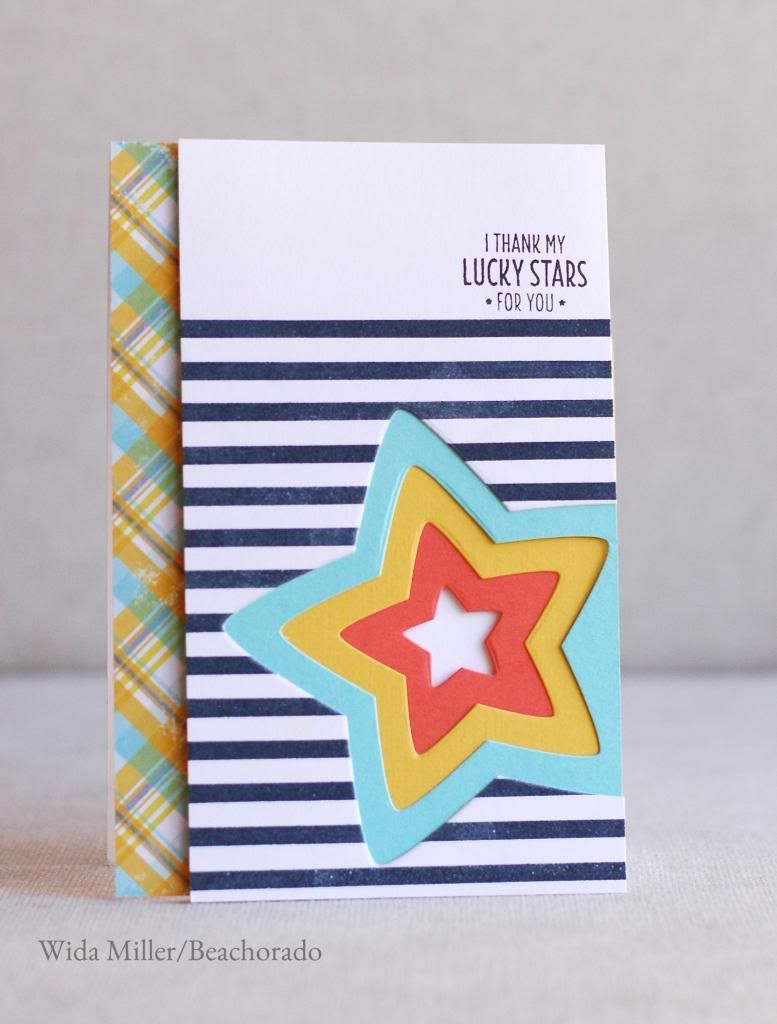
Off I went to check my stash and I came up with this:
I still loved the plaid. SO I texted Laurie Willison and Amy Kolling. Laurie voted polka dot. Amy voted plaid. Now I want to know, what is YOUR VOTE??
Please take my poll I will draw one random winner from the comment section for a prize....stamp set by Clearly Besotted Stamps called Twinkle Toes, deadline for the blog is Friday October 4th, at
midnight EST.
***********************************
VOTE BELOW:


PLAID!!!!! THAT LAST CARD!!!!! Plaid is nice, but a bit too busy because you have simpler patterns on your main panel :)
ReplyDeleteOh, and love your new blog design <3
I adore the plaid and it's so well matched colouristically, but I concur Pamela on the question of matching the simplicity of the card. Therefore it's polka dots for me! I say, when in doubt, add polka dots :) Or stripes! Or both! LOL
ReplyDeleteBTW, I adore the design of the blog, I truly do! It's not busy at all, the stripes are ever so subtle and add so much class. The banner is truly adorable and I wouldn't change it for a bigger font as you suggested on FB. It's very you, if I say so myself. The only thing that throws me off is how small and light the under-banner menu is, in comparison to the fonts used in the sidebar. Iwould make them bigger and clearer. Everything else - perfect!! You inspired me to revamp the look of my blog a bit, I've been thinking for long that the design is too crazily busy :)
The last card nailed it! Awesome!
ReplyDeleteI like the polka dot.
ReplyDeleteHi Wida! Loving the polkadots....Love it! Oh and loving your new blog design :)
ReplyDeleteThe polka dots, I think, although the colours from the plaid are closer to the inspiration I feel they clash too much with the bolder stripes in your main panel. Points for persistence though - I know how that feels! BTW the new blog header is lovely. :-)
ReplyDeleteI really love your first card if we're following the runway model. The last card is definitely more eye appealing if it was following an inspiration. LOVE your newly designed blog too...it inspired me to get a different look myself!
ReplyDeleteWell that was like going shopping, visiting every shop, then going back and buying that first one because it really caught your eye! I think the first one is much more you (must be that big flower). My second choice would be the last one.
ReplyDeleteLove the new blog look - the peachy text is easier on the eye than the bright blue.
Wida! I mean this from the bottom of my heart from one crafty friend to another. You are amazing Momma. YOU. All of your stuff is incredible :) Stop being so hard on yourself love.
ReplyDeleteAlso I loved your first card and the last one. Oh and all the ones in between <3
Another (casted) vote for the polka dots! Although the first flower (embossed and inked) comes second close. I actually see it very you :) Loved to read about the whole creative process. Crafty friends are the best :D
ReplyDeleteMy favourite is the polka dots - but I really second the don't be so hard on yourself! If you enjoyed making them that's the best part.
ReplyDeleteI think you came out with the winner in the end :) Btw, this whole post is so embarrassing....for me, lol. Love, love, love the new blog look!
ReplyDeleteI voted for the last, polka dot, card. BUT, I really like the first card, too! (before the sanding, LOL!) For me, the first card reflects the inspiration more closely. I loved reading through your journey of evaluation! You are such a perfectionist! :-)
ReplyDeleteI just love your first card! It fits the inspiration photo so well! If I have to choose between plaid and poka dots, I'd go polka dots, but the first card is definitely my favourite :)
ReplyDeleteFour beautiful cards, I be happy to receive any of them. Thanks for sharing your design process. I chose the Polka dots because the bolder colour drew the eye down and the stripes led you to it's colour match in the stars. The plaid didn't direct my attention as much, but has a more subtle feel. Love the graphic feel of the third, just prefer the colours in the stars. The flower cards are fabulous and a perfect match for the inspiration photo, however having seen the simpler bold design with the polka dots my vote was taken :)
ReplyDeleteSuch a fun post...well, probably not for you but I loved reading the process of your cards...oy to the sanding. Here's the thing, I consider myself a plaid girl & a polka girl...love them both but there's something about the polkas that sing to me:)
ReplyDeleteI have to say, I still like the plaid! The colors seem to pull everything together! That being said, I think each card is fabulous in some small way! I know how you feel - it is so easy to be hard on ourselves, isn't it? Thanks for sharing your process with us!!!
ReplyDeletehousesbuiltofcards@gmail.com
www.housesbuiltofcards.blogspot.com
The more cards the better! I Love it when You are indecisive.....Plaid is Groovy...go plaid:)
ReplyDeleteWell, I have to say that even if it isn't 'you' I really like the modern card with the square on an angle. But, if we're choosing between plaid and polka dot I like polka dot
ReplyDeleteOh, my gosh, Wida, you are a riot! I suppose it's wrong of me to like your very first card best?! Next time email me, ha! But I really do. I love that cornflower blue. And anyways I can't vote between plaid and polka dots. That would be like asking me which twink I love the most!! (I'm not voting because I would rather someone else have the prize since I'm up to my eyeballs in NBUS!) Hugs, Darnell
ReplyDeleteYeah, I loved them all! I do have to say though, that the plaid was my fav! You rock it Wida!
ReplyDeleteWida, you have such amazing blog friends! Masha'Allah so popular :)
ReplyDeleteYou know I liked the first one when I first saw it. However, on second time looking at it I did think it was a little too busy with patterns and the sentiment didn't show much. Call me a strange ball, but my favorite is the square one! However, between the polka dot and the plaid I like the polka dot better as it looks more interesting and somewhat captivating :) By the way, I am one of those minority who voted for the square card.
I love the new look of your blog, Wida!
ReplyDeleteAnd your post is so fun..... it's nice seeing that not everything you make is perfect on the first try! ;)
I voted for the last card with the polka dots and the star. :)
I voted for the star with the polka dots. I really liked it with the plaid, but once I saw the polka dots I thought it was perfect!
ReplyDeleteooooh my goodness you are determined! i really love the final product! and lucky you to have so much helpful feedback!
ReplyDelete-Rachel w k
rwkrafts.com
I really love them all!!! Even if i voted for the Polka Dots...you've done a beautiful job on every single one!!!
ReplyDeleteHow unfair is that Wida! I love them all, but I will vote. All of them are so different but fabulous
ReplyDeleteThey're all fab, Wida! Love seeing how they all evolved. I voted! Do you still like the plaid?
ReplyDeleteI vote for Polka Dot!! The final card is AMAZING!!
ReplyDeleteI voted for the polka dot, but any one of them is just fabulous.
ReplyDeleteHaha!!! What a fabulous post with FOUR AWESOME cards......The first and third cards are my favorite! :)
ReplyDeleteVoted for the embossed one...love the softness of it..my second choice is the star with polka dots ..third place stitched square and last the star with plaid...
ReplyDeleteMost important is which one you like the best.......that is the only thing which really counts!
love your work Wida..it always is so perfect...didn't think you would struggle like me....
hugs Holly
Hurrah! Glad im not the only one who has these crisies of indecision! The flower looked fine before u sanded it but I do prefer the star design... But I like both of em! I only voted for the plaid cos when I scrolled down to that portion I went "ooh!" but they each bring out the different colours of the stars, theyre great!
ReplyDeleteJust voted, what a great idea!
ReplyDeleteWowza what an effort! Call me crazy but I absolutely LOVED your original effort, I think it was gorgeous! (Pre-sanding, LOL) :-) But I also love the final card too. I pretty much think anything you make is winner, you are amazing.
ReplyDeleteI would have stopped at the first card, no matter what your friend said! It is great. But - that being said - my fav of them all is the last one with the polka dot border. Thanks for the chance at winning the stamp set.
ReplyDeleteLaura Holt
i do think the red in the polka dot paper balanced things out a little more than the plaid one. thanks for sharing the "process" and love that you are so honest!
ReplyDeleteI love seeing your process! I love the polka dots - it really balanced the heavy stripes and echoes the colors of the star layers - the plaid seems to conflict with the heavier stripes (but really not too bad - I liked it before I saw the dots, lol.)
ReplyDeleteI love the polka dots card, but I think the first one is gorgeous, and to me, speaks best to the inspiration photo. Not sanded, though. No.
ReplyDeleteCame to let you know...I'm so happy you liked my little Festive Friday sledder, Wida!!! He's a happy little guy, isn't he???;) Thanks for your sweet comment!!!
ReplyDeleteOK, my two cents. I like the embossed blooms but would have used a navy ink to highlight them. I truly like the unexpectedness and contrast of the plaid and the stripes (which BTW are super cool and very Wida with the stars) and I think it would work for a guy. The polka dots are fun and feminine. And expected. For what that's worth ;))
ReplyDeleteSo fun to catch up : )
ReplyDeleteLOVE the new look of your blog. So fun and fresh!!
The square card reminds me of clothing ... maybe because it's so clean and crisp. Like it a lot! The plaid card I love and I think is more you than the polka dots, but I also enjoy the polka dots. If this was on someone else's blog I'd vote dots, but on your blog I vote plaid.