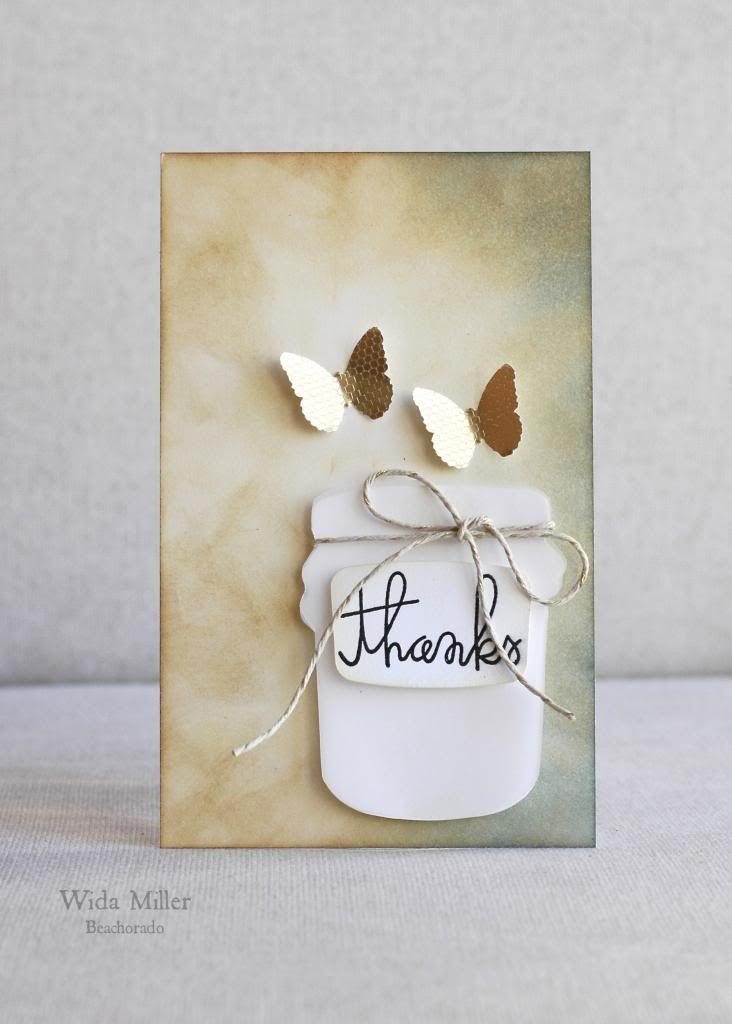
Oh my gosh this one was a tough card to create. It didn't always look like this. Brace yourself, I am gonna show you the original card.

This was the original card:
Here is the inspiration photo:
The Paper Smooches Sparks Design Team
Wida

I used 3 different distress inks to create the background. I use a make up sponge to apply the inks. It's cheap :) The butterflies are a Martha Stewart punch. The twine is by Lawn Fawn, and that delicious sentiment is Paper Smooches Sentiment Sampler
This was the original card:
it's blurry, I think that's for the best. Ouch! The card had so much potential but then suddenly it took a turn for the worse and then there was no saving it. I had to start over.
Here is the inspiration photo:
The Paper Smooches Sparks Design Team
Wida


Love, love, love this gorgeous distressed background!
ReplyDeleteLOVEEEEEE THE BACKGROUND <33333 And I think you did an awesome job salvaging the card :)
ReplyDeleteLove your starting over version! It's so serene, and I think the sentiment on the jar balances the design better than the first version.
ReplyDeleteWida, I adore your final card. Fabulous background, and beautiful space! A definite improvement from the original. ;-)
ReplyDeleteLovely evolved card! The second one looks like something I would have made and been proud of hahaha. Great distressed background!
ReplyDeleteGORGEOUS!! Thanks for showing your original card :) I would love to know the distress ink colours you used.
ReplyDeleteLove that you showed the Mark 1 and Mark 2 versions Wida and the final card is a beauty!
ReplyDeleteWow, that is just piss elegant. I have those "First drafts" a LOT. They don't usually make it in front of a camera. Nice to know the "big girls" have to go through it, too...
ReplyDeleteI'm glad you started over, I have had several cards that couldn't be resurrected....the one you ended up with is stunning though, seriously GORGEOUS!
ReplyDeleteBoth cards are gorgeous, but of course, the new rendition is even more perfect with the inking and delicate butterflies! GREAT job, Wida!
ReplyDeleteLOL! I love both of your cards-- I LOVE the gold and the background design! AMMMMMMAZING job! You nailed this photo! And don't worry- you are not the only one who has had to start over! <3 YOU ROCK, Wida!! <3
ReplyDeleteI love the ink distressing on both cards and the dimension from the butterflies on the second. Both are great, Wida!
ReplyDeleteSuch loveliness with the shading of the DI on the right of the panel and those dimensional flutterbys. Beautiful card, Wida.
ReplyDeleteThis is so cool, love it.
ReplyDeleteHow awesome to see not every card works out for you too! Thanks for showing the "one that didn't make it" -- meanwhile, your finished one ROCKS!
ReplyDelete*Love* the finished result Wida! And really appreciate you showing the 'before' as well! A well made-over card. :-)
ReplyDeleteThis card is stunning!
ReplyDeleteLove the makeover!
ReplyDeleteThe distressed colors look AMAZING! I love how this card is distressed and still has your signature style!
ReplyDeleteFabulous distressing girl! You did a FAB Job!!! Love it!
ReplyDelete